My First Android Library, Part I
What I learned from building a custom widget

I built a software library recently. It’s a page indicator for mobile apps; the kind you’ve probably seen before with dots that change color to show what page you’re on. The one I made replicates Google’s latest iteration of this pattern with Material Design inspiration. It’s really rather cool looking, I think:
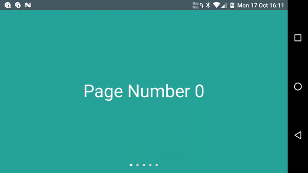
As you can see, each dot represents a page, where the white dot is the current page and the gray dots are the other pages. When we change pages, the white selected dot page moves along a little path to the new current page.
Anyway, I wanted to use something like this in another app I was making, but alas, there isn’t an official version available to the developer public. I found that Nick Butcher, a developer at Google, has a version of his own included in a Material Design sample app, which as of this writing is pretty much as close to official as it gets. Sure, I could borrow that class, but… could I make my own version?
There is a first obvious question whenever you’re considering doing something like this.
Why reinvent the wheel?
Today’s Answer: Because we want to know how the wheel works, of course.
Breaking down the animation
The first thing I had to do was figure out how the animation works. The natural first attempt relied on what I could observe with my own eyes, but eventually I found some other tools that helped me comprehend the animation in greater detail.
Tool #1: Eyeballs
Let’s take a look at what we have here. Here’s the first official example I found from the Google Opinion Rewards app (as of the time of the library’s creation, this was actually the only Google Android app on my phone that was using the indicator, despite its appearance elsewhere; others are using a version that does not animate).
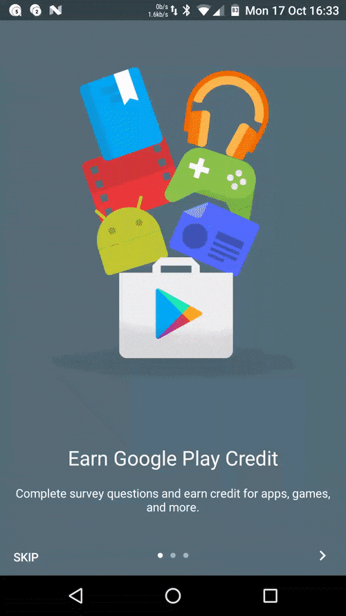
Perhaps you’ll agree with me that from our high-level human standpoint, it appears pretty simple. You can already catch a lot more detail than I originally gleaned from blowing up the image, but here’s what I figured out from staring at that the tiny version on my phone for embarassingly long:
- The dot for the current page makes a path to the dot for the new page.
- The white current page dot slides along the path to its new location.
- The path that was created shrinks back under the white current page dot.
Is that all we need to do to replicate this effect? How can we break this down in more detail?
Tool #2: .GIF frame splitting
My first attempt at breaking this down involved sticking an image I found on GitHub through a GIF splitter and looking at each frame in the GIF. I discovered that DavidPacioianu on GitHub extracted the indicator from Nick Butcher’s sample app (the one I mentioned at the beginning) and set it up as a separate library. In the repo README, he helpfully included a GIF of the isolated animation.
(Truthfully, this journey almost ended upon me finding his version, but sometimes you really just need to satisfy your own curiousity and satsify the itch to build something.)
I grabbed the image and ran it through ezgif.com’s GIF splitter. This method, though crude, helped me update my animation analysis with a lot of the details that were too fast for me to catch with just the naked eye:
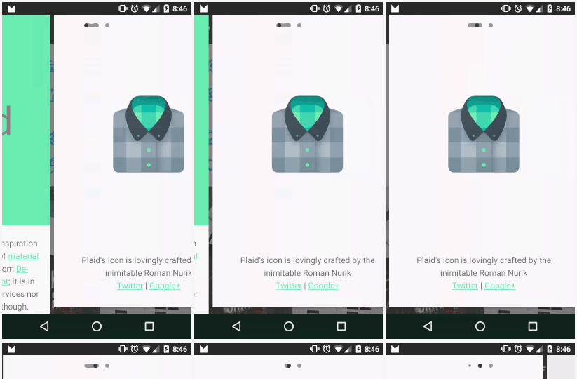
- Both the dot for the current page and the dot for the new page start stretching out toward each other.
- Those two dots form a path.
- The current page dot slides across the path to its new location.
- The path retreats from the last page dot to the new page dot, taking the old dot for that page with it.
- While the path is retreating, a new dot for the last selected page grows out of where the last dot was taken.
Wow! It turns out there was a lot more going on than I had initially thought. After deciding that no, I wouldn’t let the existence of this alternative library deter my learning experience, I now had enough information to get started.
Tool #3: “Animator scale” Developer Setting
While using the GIF splitter helped me get started, I found out while building the library that there’s an even better way to go about this. Specifically, the largest benefit of the GIF breakdown approach is also a huge downside: the breakdown is made up of static images, so it’s very difficult to find out how long each animation takes. (It’s probably possible to calculate if you know the frame rate of the source image, but that’s a bit of a pain.)
Anyhow, it turns out that you can actually slow down animations globally across your Android device using the Animator scale option in Android’s Developer Settings:
For the uninitiated, Animator is a core class from the animation framework introduced in Android Honeycomb. It represents an animation “which can be started, ended, and have [listeners].” So, by altering the Animator scale setting, any animation across the entire system that uses Animators to operate will have their natural duration scaled accordingly.
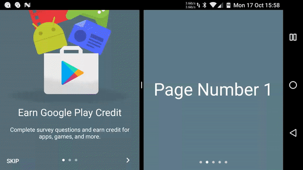
Using this tool, we can now really pick apart the animation we’re seeing. At an Animator scale of 10x, i.e., animations take ten times longer, we can see all the details in a working example of the official widget (source: Google Opinion Rewards app). I’ve used Android Nougat’s multi-window feature to show this side by side with the version I made. Each animation is shown separately because Nougat doesn’t like simultaneous swipes on both apps:
Cool, right? This breakdown ended up being really helpful when I was trying to match animation timing for the library (it’s pretty close, and it will get even better as the library develops!), which we will get into in a future post.
Thanks for reading! See you next time.

Share this post
Twitter
Google+
Facebook
Reddit
LinkedIn
StumbleUpon
Email